
Insights on Our Instagram-Styled Color Grading(關於 IG 菲林調色)
我們想簡單介紹一下 IG 色彩風格與基本色彩調色之間的不同。
由於您可以選擇其中任一風格,因此在做決定之前,了解每種風格的效果會對做最終決定很有幫助,亦由於每次拍攝的作品都會有差異性,所以以下的色彩風格僅作為參考之用。
選擇風格完全取決於個人的品味和偏好。都沒有優劣之分。如果您在做決定時遇到任何困難,請隨時與我們聯繫。
We’d like to share some insights on the differences between IG-styled color grading and the original basic color tuning. Since you can choose either style for your deliverables, it’s helpful to understand how each will look before making your decision.
Due to the variability in each shoot, the following color styles are for reference only.
Ultimately, choosing between the styles comes down to personal taste and preference. Neither is superior to the other. If you have any difficulty making your decision, please feel free to reach out to us.
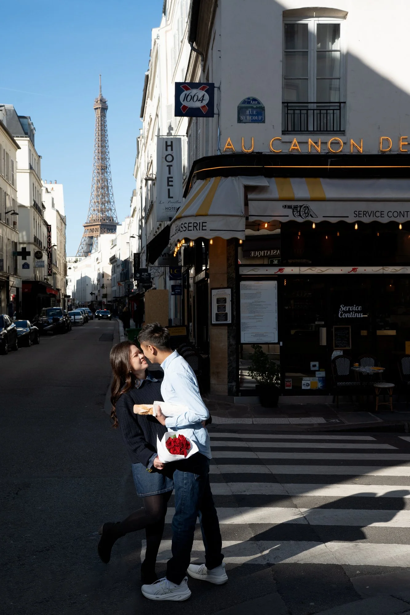
原圖 Original Photo
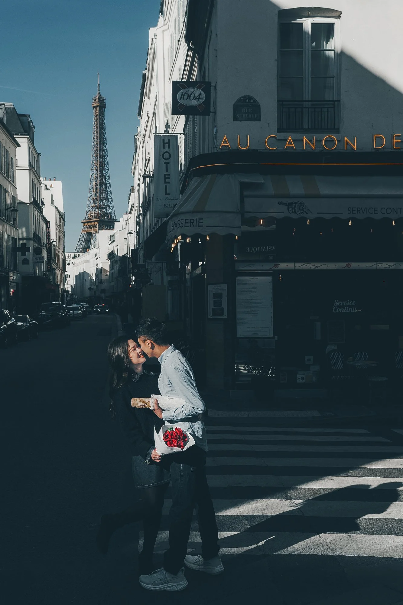
Film Effect【菲林電影感】:帶柔和灰霧,適度對比統一色調,加入菲林顆粒,營造故事氛圍
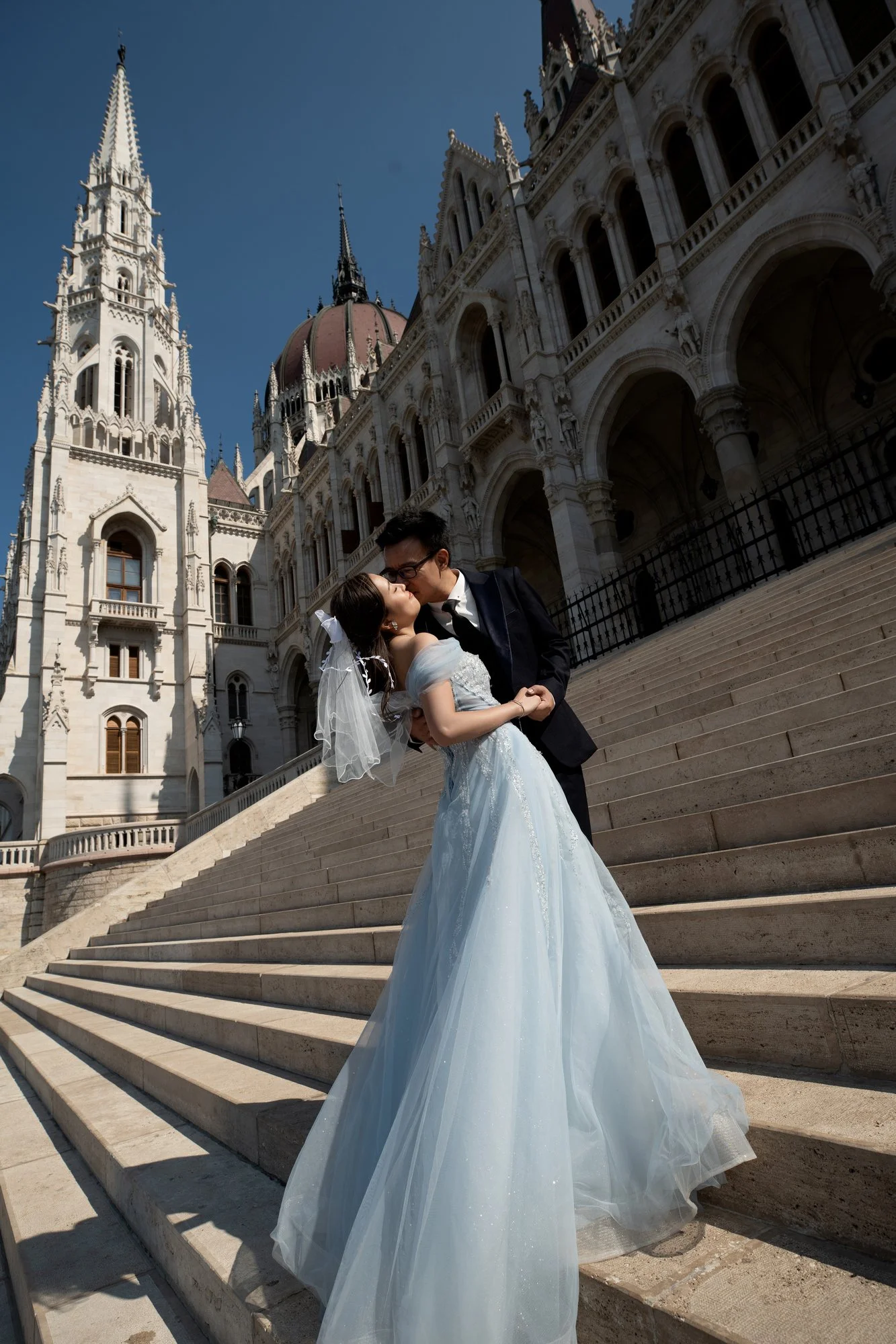
原圖 Original Photo
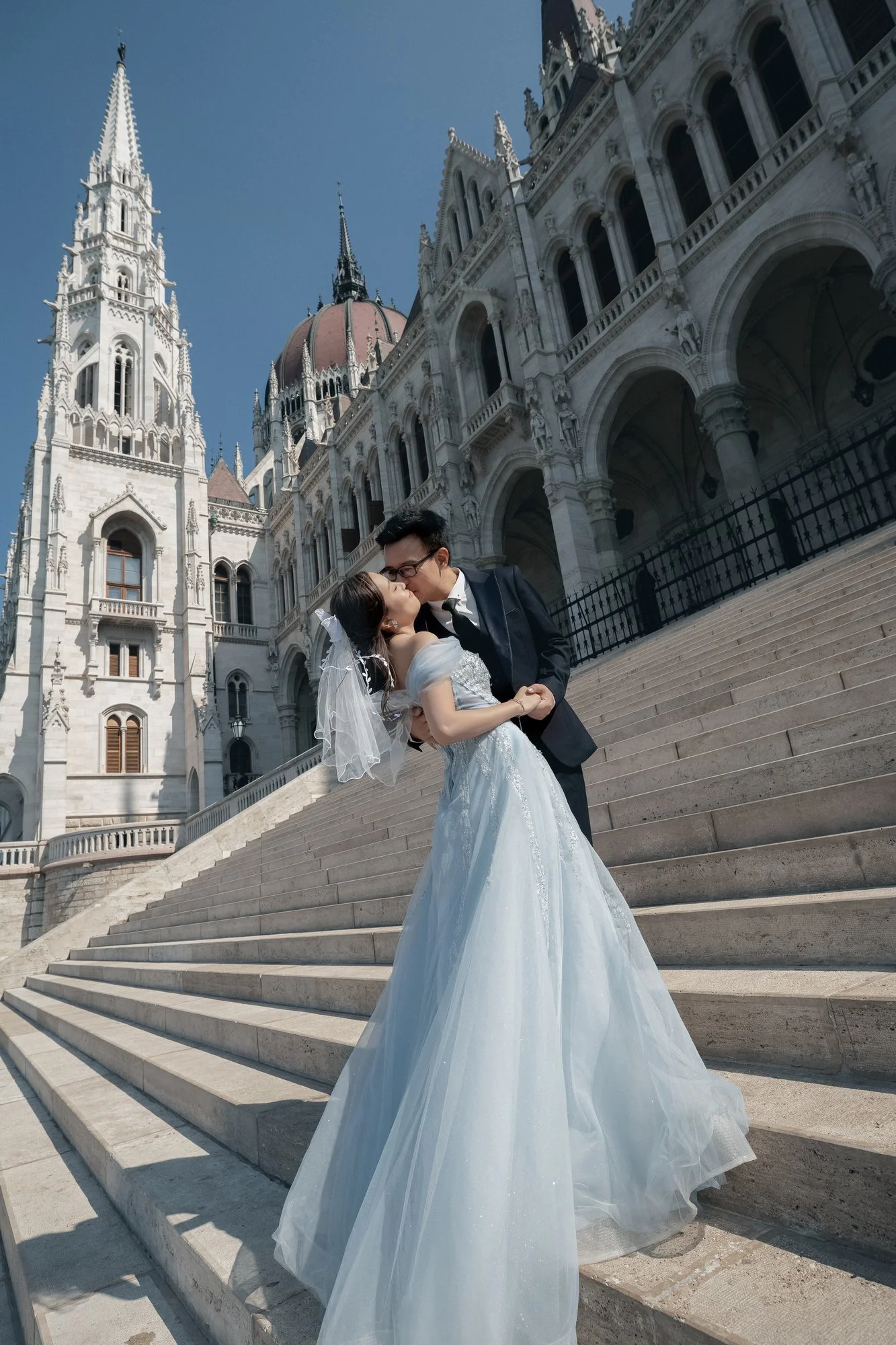
Fresh Effect【日系清新廣告感】:畫面明亮通透,膚色乾淨淨雅,適合陽光外景
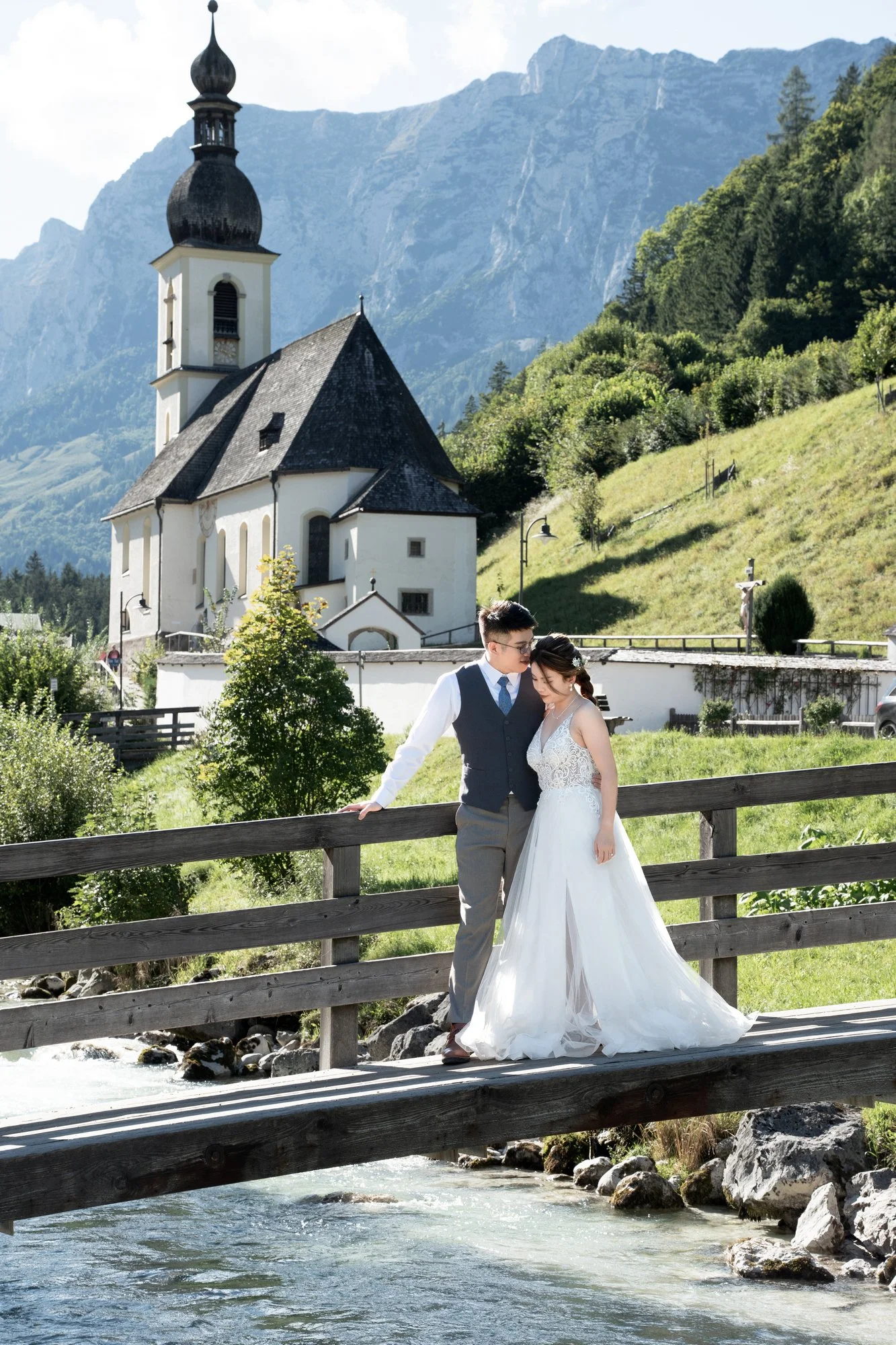
原圖 Original Photo
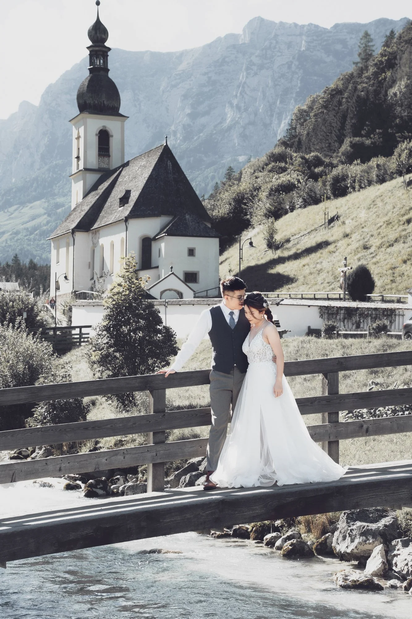
Muted Neutral【低飽和極簡風】:柔和低對比中性色,簡約高級,也適合室內場景
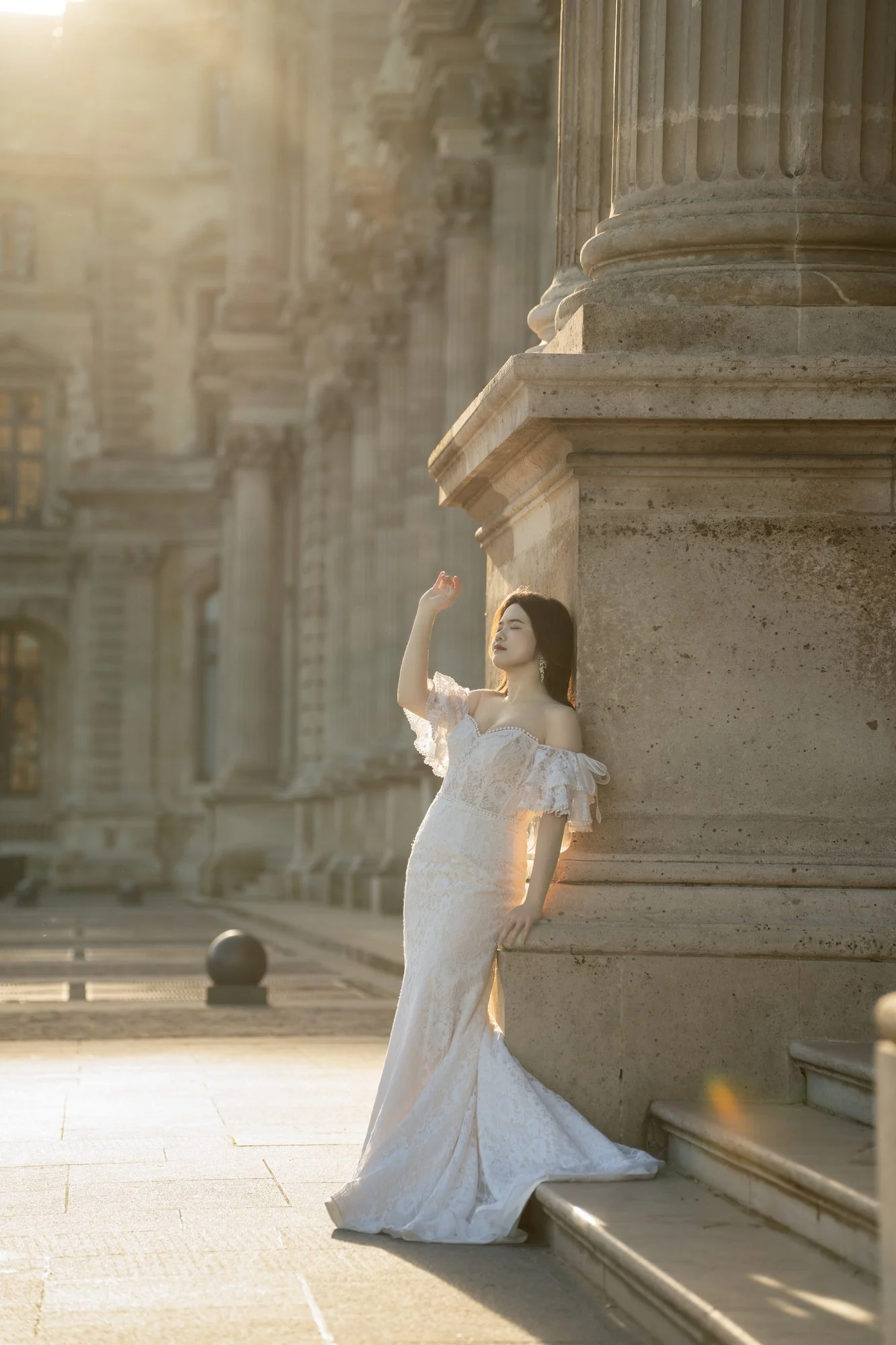
原圖 Original Photo
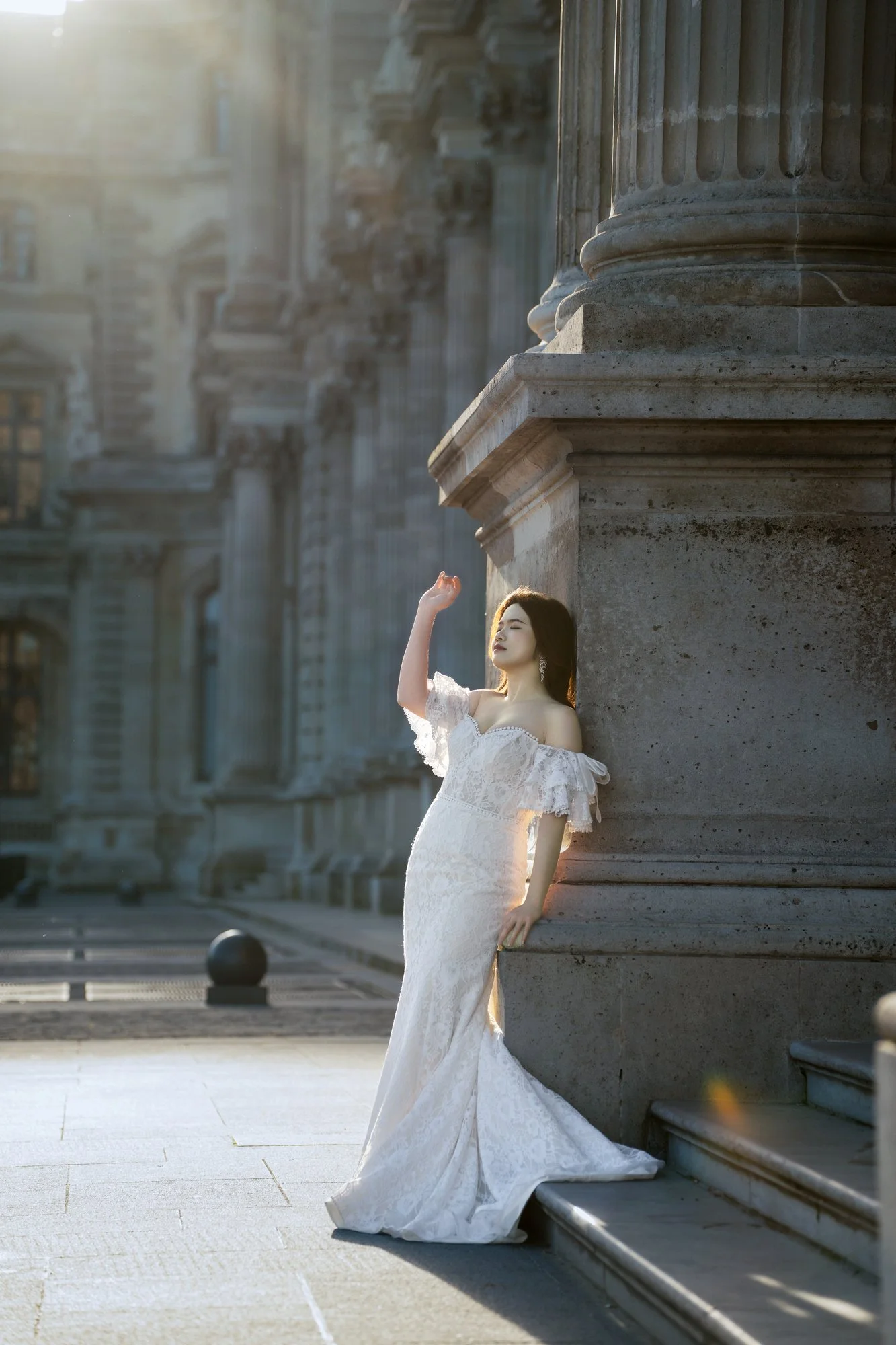
Fine Art Effect【藝術油畫風】:強化光影對比,壓暗背景突出主體,層次厚重